World Trade Center
Determined optimism
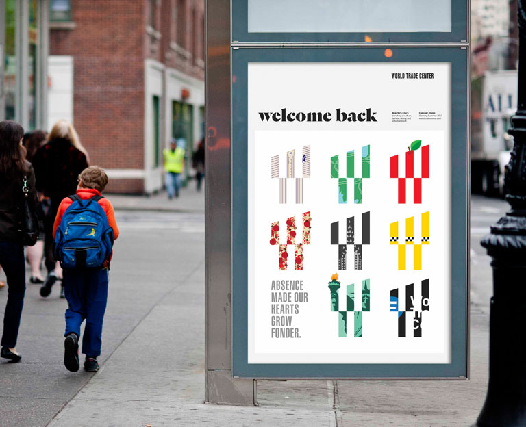
With so many of the sites stakeholders sending out conflicting messages it was time for the World Trade Center to develop an overarching identity to unify the campus.
- Client:
The World Trade Center - Location:
New York, New York - Project:
New identity - Objective:
Create a new identity with sufficient flexibility to cater all the needs of the campus - Disciplines:
- identity
- environmental graphics
- print design
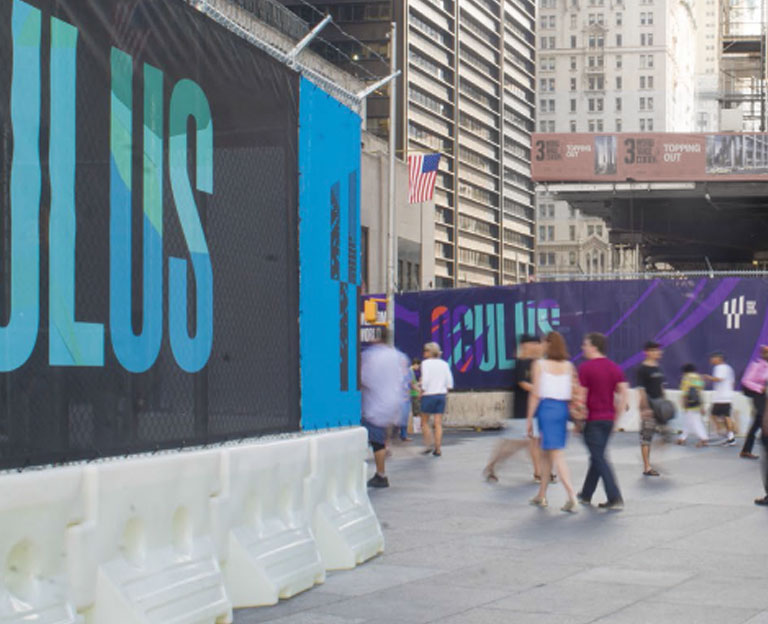
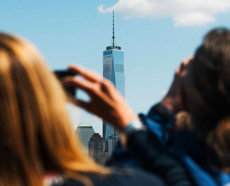
The World Trade Center campus is a 16 acre site that connects PATH trains and ferries from New Jersey with 11 New York subway lines, has over 7 million ft.² of office space, over 350,000 ft.² of retail space, a park, a church, a memorial, an observation deck and the tallest building in the western hemisphere.
In order to bring calm to what could be chaotic, I was hired by the Port Authority to help project manage new World Trade Center branding and signage. Landor won the task of coming up with the design and my job was to help choose the identity and shepherd it through the many levels of approvals needed for it to be implemented.
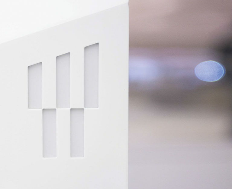
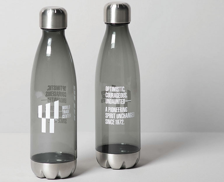
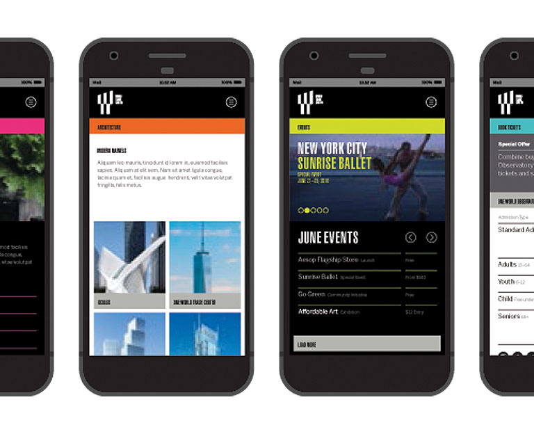
The resulting identity was uniquely appropriate and flexible enough to strike the right tone no matter what the situation. The signage, based on key branding elements, was developed to work in harmony with the distinctive Calatrava architecture on the site.
In 2018 the World Trade Center logo was selected by Architectural Digest magazine as one of 12 logos in the world that best represents its buildings.